
Listing Fields in WSN 9.0+
As of WSN 9.0, you can use the field manager utility at Admin Panel -> Listings -> Link Fields to add and edit listing fields. This utility makes everything easy for you while providing complete control.
Other Fields and Older Versions
Go to Admin Panel -> Customizations -> Add Fields to get started.
For example purposes, suppose you want listing submitters to be able to specify a color for the listing they're submitting. Choose 'listing field' and type a suitable label such as 'color' (please note that the field name has to be alphanumeric, no spaces or accented characters -- keep it short and simple). Next, select the desired way to collect the input from the user -- a simple input box, a dropdown selector, checkboxes or the like. The simplest method is a regular input box, that's what you usually want. If the content will be a large amount of text (perhaps an article), you will want to choose the 'text area' option. If you wish to display options to let the submitter check a box for each one that applies to their listing, use checkboxes. If you want to let them choose a single option from a dropdown menu (like the category selector in the top right of your screen now), then choose 'dropdown selector'. If you want a combo box that allows multiple selections (like your 'related categories' options on the edit category page), choose 'multiselect combo box'. To list several options in the same style as checkboxes but only allow the submitter to choose exactly one option (no more, no less), choose 'radio button'. If this field is not something that you want to be selectable or editable by anyone (even yourself), you may wish to make it invisible.
For our color field, we'll likely want these selections:
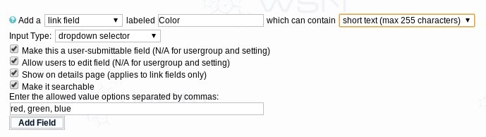
Note that we've filled in the list of colors in the box that appears for that when we choose to make it a dropdown selector. Make sure you do a comma-separated list.
Next we come to a series of self-explanatory checkboxes which you normally want to leave checked, unless you don't want non-admins to submit or edit or you don't want the field's contents displayed or you don't want people to be able to search the field. We're ready to press the Add Field button now.
Now that the field has been added, you may want to edit the appearance of it. At Admin Panel -> Themes -> Manage Templates you'll find a "Custom Fields" section where all the custom fields code gets inserted by default. For the listing color field we just added, click the "Add/Edit" next to Link Fields. You'll see the table row there which prompts people to choose the color and you can make any changes you want there. Sometimes, however, you want to control exactly where on the page the field appears -- you can do that by cutting and pasting from here to both the "Submit Listing" and "Edit Listing" templates at the desired location.
You can also change how the value in the field is displayed on the listing details page, or make it be displayed in other templates like the listing bit. First click the "Display" next to "Listing Fields" on the Manage Templates Page. Cut and paste the display code for your field from there to your desired location in the "Listing Details" template (or "Combined Details + Comments" if that switch is on). You can also copy it to any other template where listing variables are applicable. You may want to use template conditionals to control the display.
For types of fields other than listing fields, there's no autogenerated display code. Instead, you'll have to write your own using the template variable it gives you when you make the field... that'll be { + TYPE + FIELDNAME + }, for example {CATSPECIAL} for a category field named special. For a category field, you'll probably want to show it in the main index template. For a member field, the view profile template.
Selectors and Checkboxes Notes
If you're dealing with a single checkbox or single selector and want to test if a value is selected, you can use {LINKCHECKED[fieldname]} (or {CAT, {MEMBER etc) in your template conditional. If dealing with multi-value checkboxes or selectors, you can use {LINKCHECKED[fieldname <,> value]}> to test for each value. If you just want a comma-separated list of all selected values, use {LINKSELECTIONSLIST[fieldname]}. Don't use the plain {LINKFIELDNAME} template variable as it will not produce the expected results for a mutli-value field.
Advanced Notes
If you add a custom setting, as of 7.1 it will go to the "custom settings" template in the admin cp templates. A new "custom settings" option will appear in your admin panel left frame menu at the bottom of the settings section.
